Selectbox
In our system, we recognize the importance of creating a comfortable and intuitive user experience when it comes to providing users with multiple options to choose from. To achieve this, we make use of select boxes to allow users to easily select from a range of options.
Select boxes not only provide a convenient way for users to make their selection, but they also help ensure that the options presented to the user are relevant and available within the system. It's essential that we only include options that are truly effective and appropriate for the user to choose from.
By thoughtfully curating the options within our select boxes, we provide users with a seamless and hassle-free experience that makes it easy for them to choose the option that best suits their needs. This approach helps us to build trust with our users and ensure that they feel confident in their selections within the system.
Overall, our use of select boxes and careful selection of options is just one of the many ways we're committed to providing our users with a top-notch experience that meets their needs and exceeds their expectations.
Kinds Of SelectBox:
In our system, we believe that design consistency is essential to creating a seamless and intuitive user experience. To this end, we've carefully crafted two types of select boxes that are used throughout the system.
- The first type of select box is designed to be used within forms alongside other input fields. It features a sleek and elegant gray color scheme with 15px padding on the top and bottom, and 16px padding on the left and right. This select box is designed to seamlessly blend in with other inputs within the form, creating a harmonious and cohesive overall design.
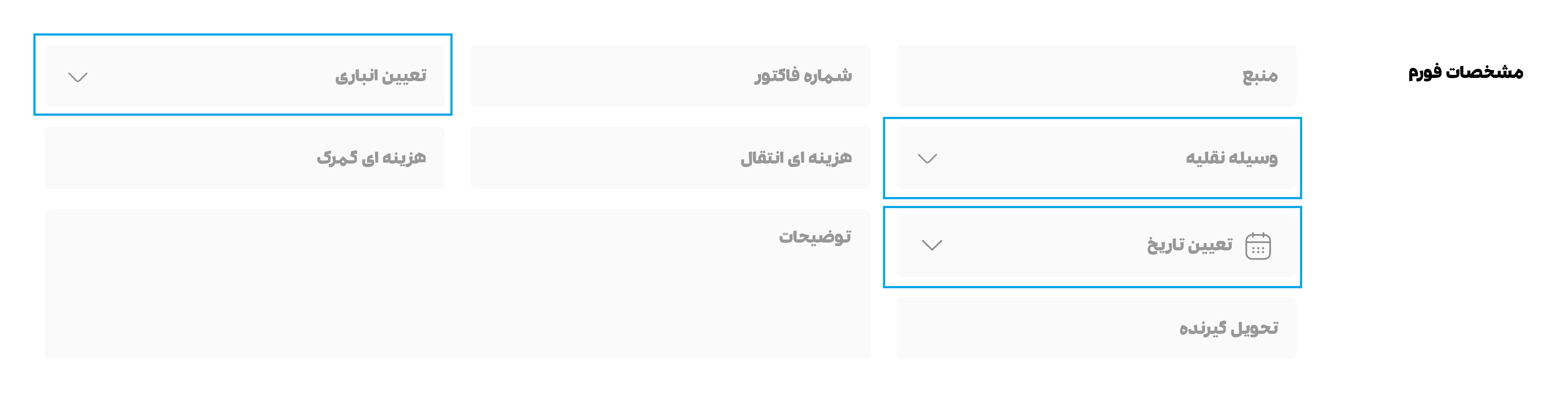
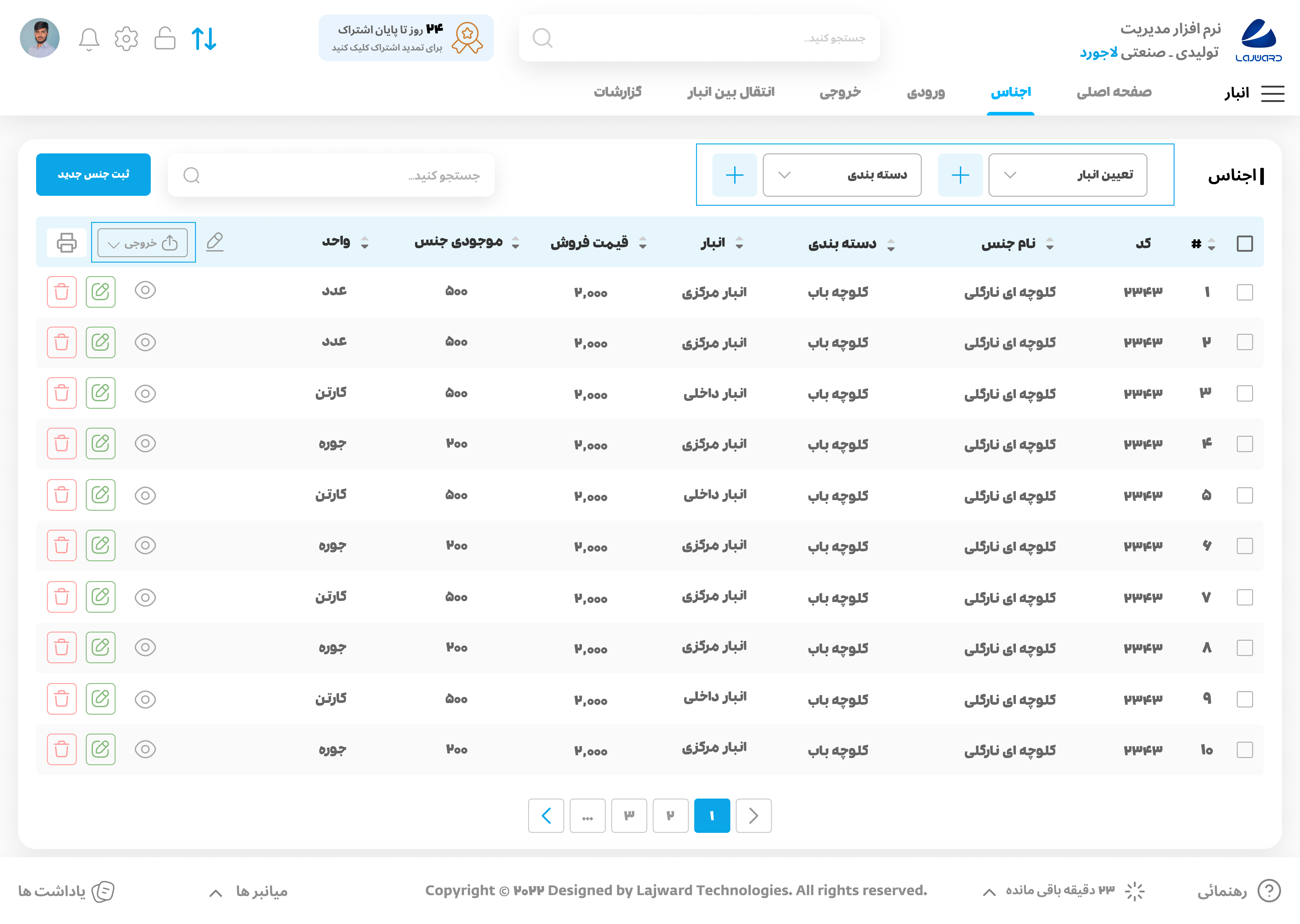
- The second type of select box is typically used at the beginning of some pages, and it's displayed with a stroke. It features 13px padding on the top and bottom, and 16px padding on the left and right. This select box is also used in other places, such as TH, with a height of 32px. By using this consistent design throughout the system, we help users feel more comfortable and familiar with the interface, improving overall usability and user satisfaction.
Both types of select boxes include a text label along with an icon to indicate that it's a dropdown menu. This approach makes it easy for users to understand how to interact with the select box, reducing confusion and improving usability.
Overall, our carefully crafted select boxes are just one of the many ways we're committed to creating a visually pleasing and intuitive user interface that meets the needs of our users.
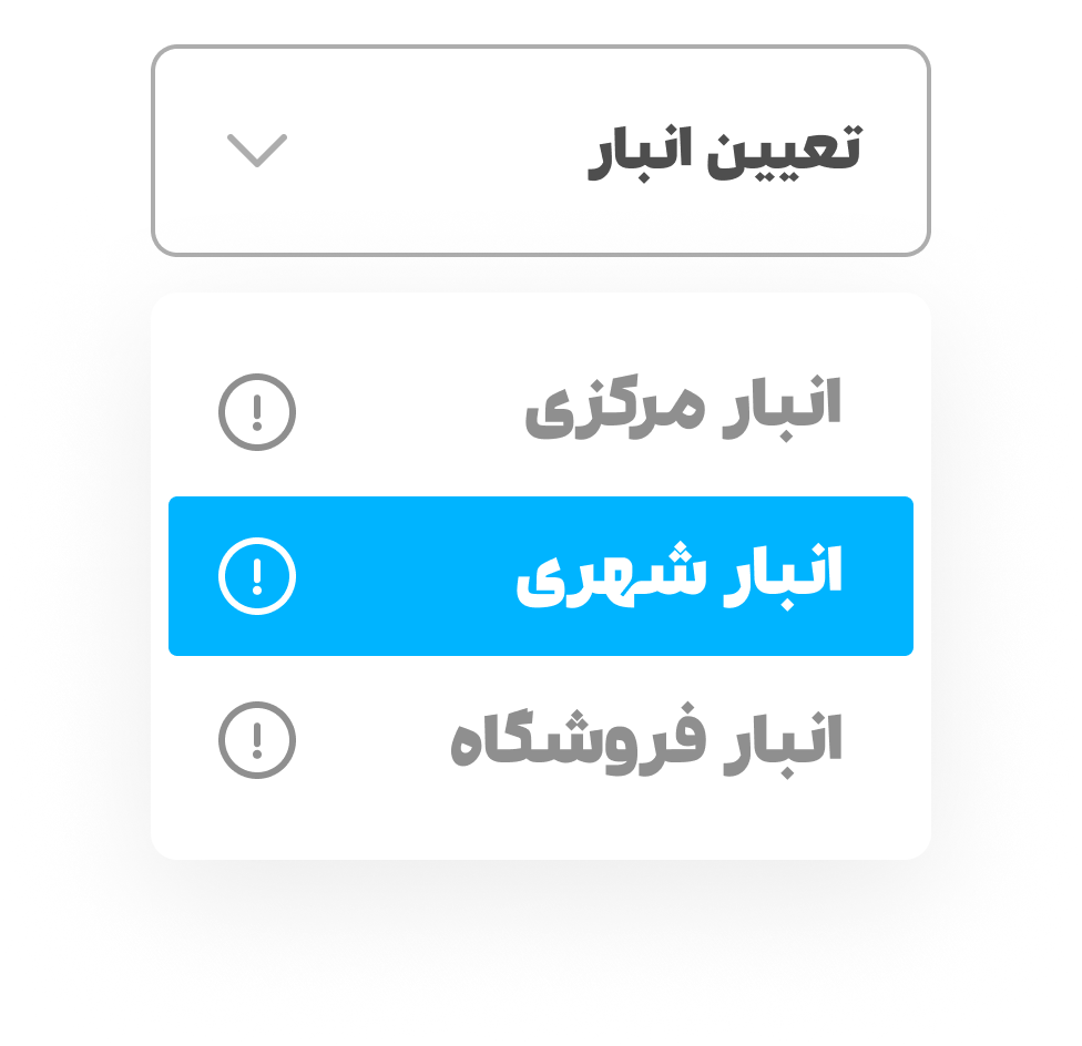
Drop down and Hover:
When a user clicks on one of our select boxes, a white drop-down box with a soft shadow opens. This design choice creates a sense of depth and dimensionality, making it clear to the user that they are interacting with a different layer of the interface. The items within the drop-down box are arranged at a distance of 12px apart, ensuring that they are easy to distinguish from one another and do not overlap or blend together.
The width of the drop-down box is the same as the width of the select box, with a 12px padding on all four sides. This design choice helps to create a cohesive and consistent visual style throughout the interface, making it easy for users to quickly understand how to interact with the system.
When a user hovers over an item within the drop-down box, the background color of that item changes to the primary color, while the color of the text or icon becomes white. This design choice creates a sense of interactivity and helps users to quickly understand which option their mouse is currently on.
Overall, our select boxes are just one example of how we're committed to creating a beautiful and intuitive user interface that meets the needs of our users. We believe that small design choices like these can make a big difference in creating an experience that users will love and enjoy using.