Button
Buttons in a user interface are typically used to prompt users to take action, such as registering a new item, creating a new invoice, or adding a new employee. These buttons serve as calls-to-action, guiding the user towards completing a specific task or workflow. Additionally, buttons may also be used to cancel an operation or close a page.
In general, the use of buttons should be intuitive and consistent throughout the interface, with clear and concise labels that accurately reflect the action they perform. Buttons should also be visually distinct from other elements on the page, using color, shape, size, and other design elements to help them stand out and draw the user's attention.
Buttons in our system can be divided into three categories. The first type of button prompts the user to add a new item, such as a new product or a new employee. When clicked, it opens a page where the user can enter the relevant information and save it to the system.
The second type of button is used when the user has entered all the required information and wants to either save or cancel the operation. Clicking on one of these buttons completes or cancels the operation as desired. If the user clicks the "save" button, a pop-up message appears to confirm that the operation was successful.
Finally, we have buttons that are used to display a detailed view of an item or an invoice. These buttons are typically displayed in a light blue color and are located next to the relevant item or invoice.
Size:
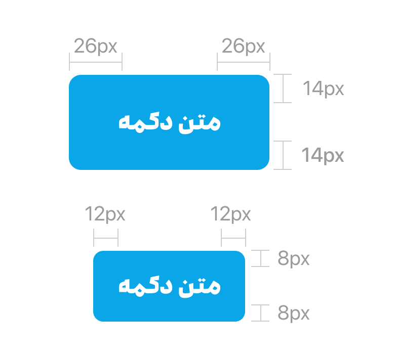
In our user interface, we have two different types of buttons: default and small. By default, we use the default button, which has a padding of 14px on the top and bottom, as well as padding of 24px on the left and right. However, in cases where the button becomes larger, the padding may be adjusted to ensure that the button maintains an appropriate size and proportion.
For small buttons, the padding is reduced to 8px on the top and bottom, and 12px on the left and right. This helps to maintain a consistent visual appearance across the interface, while also ensuring that small buttons are still easy to interact with and visually distinct from other elements on the page.
Overall, the size and padding of our buttons is carefully designed to provide a clear visual hierarchy and intuitive user experience. By using consistent padding and sizing across all buttons in the interface, we aim to create a seamless and user-friendly experience that helps users accomplish their tasks quickly and efficiently.
Modes:
Our buttons come in different modes to accommodate different design needs. The default mode is displayed with a primary color, while the hover mode is shown with the Secondary color.
For buttons with icons, we recommend a distance of 8px between the icon and the text. The icon should be displayed in white to ensure clear visibility and legibility.